About a year ago I did a short presentation on Python's matplotlib library for the Toronto Python Meetup group.
I came to it wanting to visualise months of Selenium and Apache web log data. I haven't used MATLAB or Mathematica, so I can't compare.
Here are the installation instructions. Once you've done that, you'll find matplotlib.org has an extensive selection of examples ... almost all of which are entirely undocumented. The best tutorial I've found is http://matplotlib.org/users/pyplot_tutorial.html . I stole the following examples directly from there, and they're explained there and not at all here. Come back if you're interested in plotting website stats.
import matplotlib.pyplot as plt
# matplot lib assumes these are a sequence of y values, and assigns
# x values for you starting at zero ...
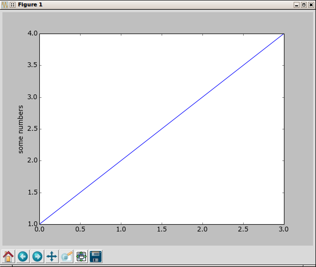
plt.plot([1,2,3,4])
plt.ylabel('some numbers')
plt.show()
import matplotlib.pyplot as plt
# hand it two matching lists of x and y values,
# followed by the plot style - a red circle
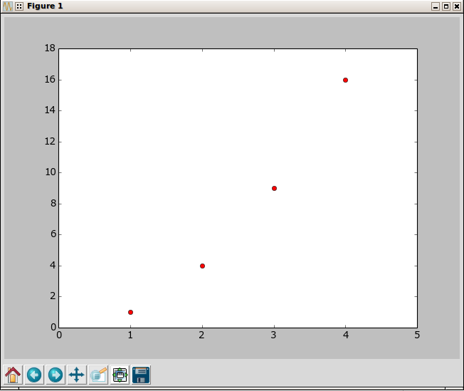
plt.plot([1,2,3,4], [1,4,9,16], 'ro')
# tell it what limits to put on the axis (otherwise it uses known maximums)
plt.axis([0, 5, 0, 18])
plt.show()
Once you have the basics under control, many people immediately progress to numpy for processing more complex data. But I wanted to dig into Apache web logs, and that meant all I needed was to be able to count things in a given period of time. But I'd have to parse a log, and you don't want to re-invent the wheel, right? So I dug about a bit online and found a parser for Apache Common Log Format. A run through our four million line log file took roughly an hour and a half, so apparently re-inventing the wheel was called for: I wrote the same parser using Python's basic globbing and a very naive approach, and a run through the same file took about 90 seconds. This is possible - and worked reasonably well - because the log format is quite specific and formatting breaks are very rare. In fact, the R.E. parser was barfing on the same lines (usually about 20-40 per log) that my naive parser was barfing on, so the R.E. parser wasn't solving the problem either.
I'm not going to talk about the code but rather about the process: most of the processing is fairly straight forward Python, and the rest is matplotlib - which you'll learn better from the tutorial above.
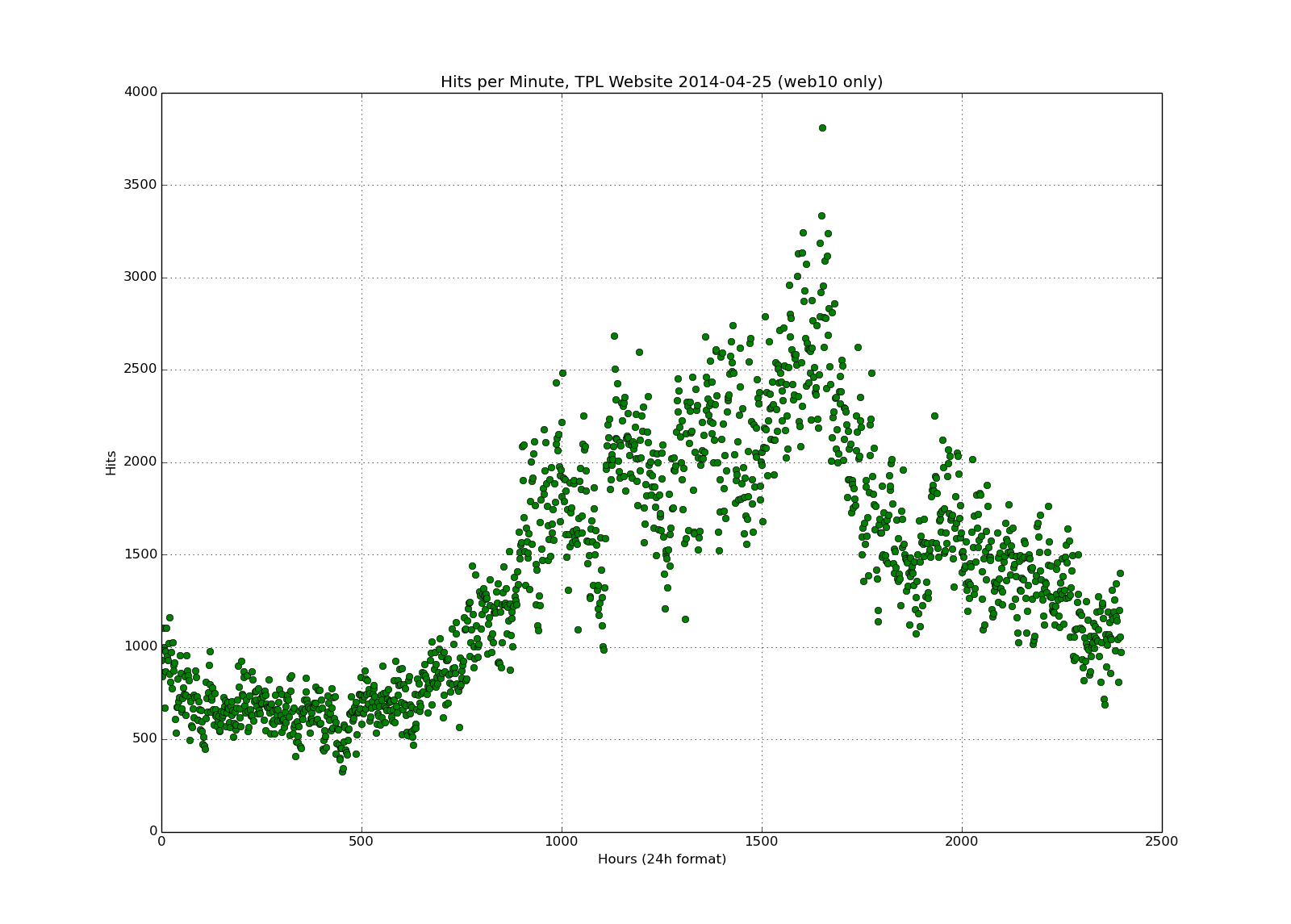
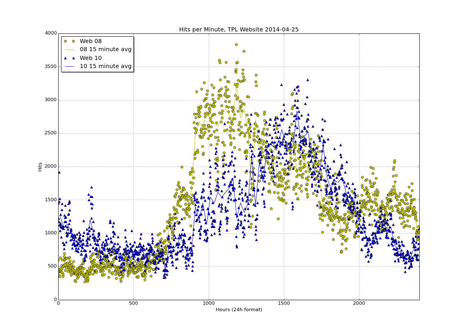
Above you'll see one of my first attempts: we have two web servers behind a load balancer, this is just one of them. You'll notice that it's on a 25 hour scale - not surprisingly, there are no hits in the 25th hour. But one problem that's already been solved is that if you plot minute data like this, on a zero to 2500 scale, the data goes from 0 to 59 and then jumps to 100 through 159 - because that's how many minutes there are in the hour. I'm not going to go into the fix for that because it's just math: multiply the time value by 100 and divide by sixty, and you've spread the values out evenly over the "100 minute hour."
From that plot, I proceeded to this one:
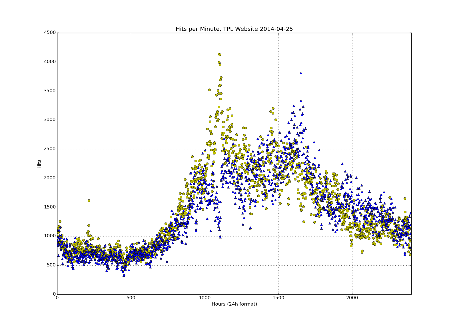
I'm now plotting the counts for both our servers in different colours. Because the scatter plot was a bit hard to read, I added a 15 minute running average for each server on top of the dot plot:
The yellow above didn't look too good, so the final colour scheme I arrived at - while not beautiful - is reasonably readable:
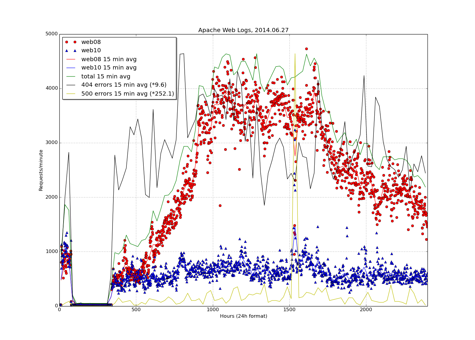
We don't like to talk about this: we had an outage. But it also shows running averages for each server, total of the two, and 404 and 500 errors. And it shows the load balancer wasn't working worth a damn. Notice that the error counts have multipliers: without them, they would be wiggly lines drawn right at the bottom of the graph and totally unreadable. So I increased their size to reach the same maximum as the maximum value of the sum of the two servers.
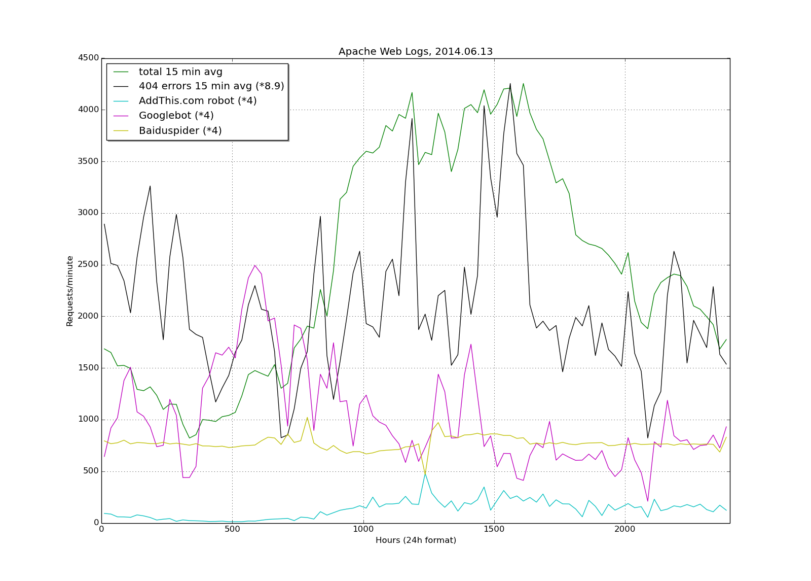
This is visits from robots only across the course of the day.
The final product on a regular day looks like this:
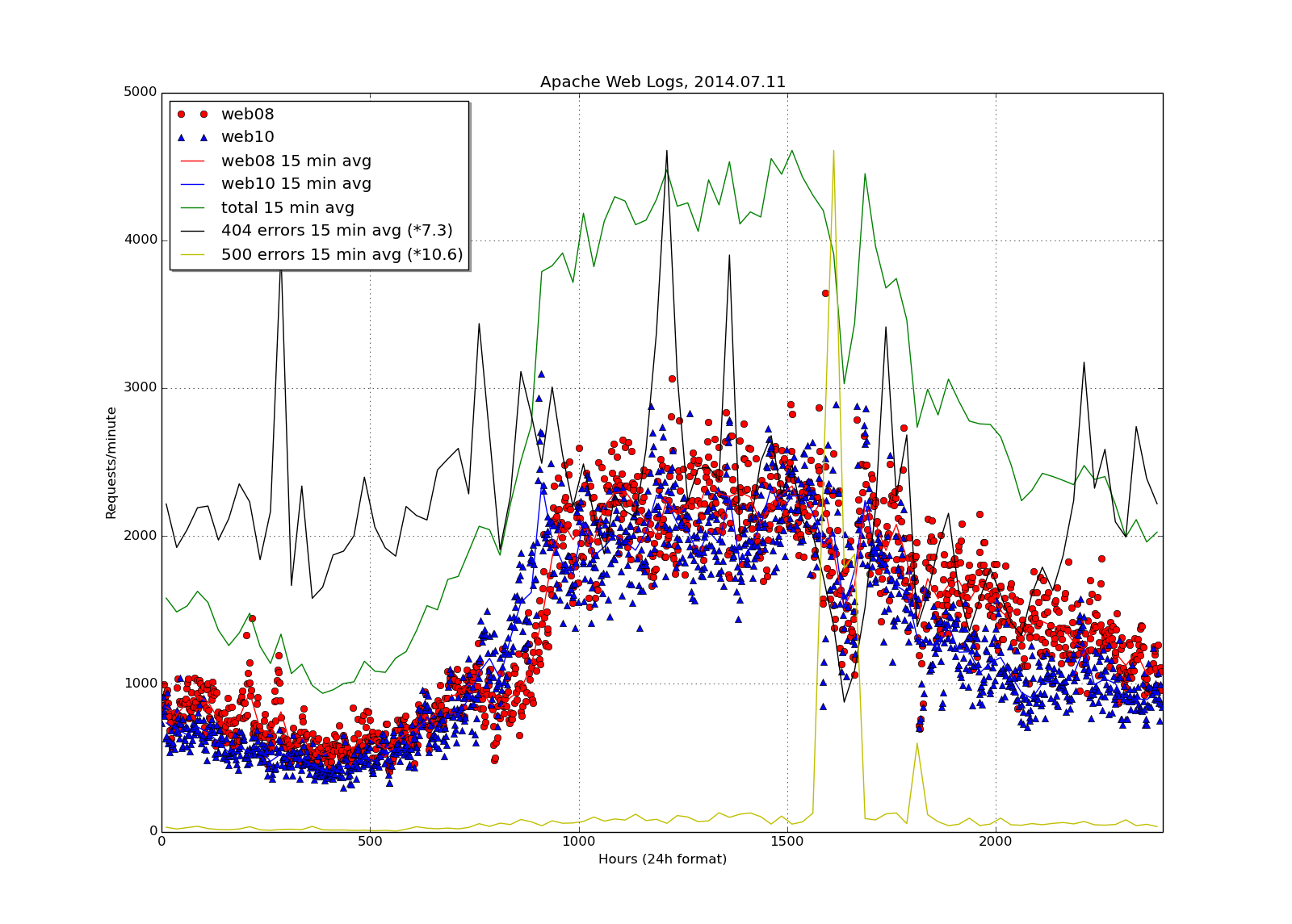
All of which brings us to the question of aesthetics and information density: you need to think about the limits of how much information you can pack on one page. I tried for a short time putting the robots plot (previous graph) over top of the day graph above, but it becomes nearly unreadable. This graph, while mildly ugly, provides a lot of information without reaching the point that it's hard to read.