Adjusting Colours
If you have a bad image (poor quality scan, bad exposure ...) it can sometimes be rescued by adjusting the colours. The GIMP provides a multitude of ways to adjust colours. Right-click on the image and navigate the menu to "Image -> Colors" where you'll find another menu populated with several different options. My preference is for the "Curves ..." dialogue: you can do pretty much anything with it that you can do with any of the other options, and I find I understand it more intuitively. Please note that you may try it out and decide it's totally UNintuitive: you need to see which method works for you.
Let's start with the seamless plasma from the tile chapter (I've set the layer mode back to "Normal"):
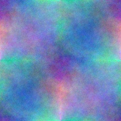
The seamless plasma image.
Open the "Curves ..." dialogue. The default for "Curves" is to modify the brightness of the entire image - but you can choose to work just on a specific colour channel. Here's the results of the most basic "drags" you can do on the curve:
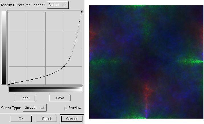
Dragging the curve down darkens the image.
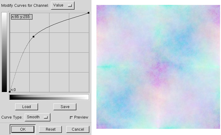
Dragging the curve up lightens the image.
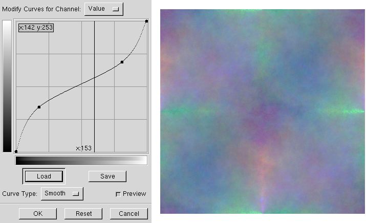
Creating an "S" curve increases contrast, but creating an inverted "S" curve like this one reduces contrast.
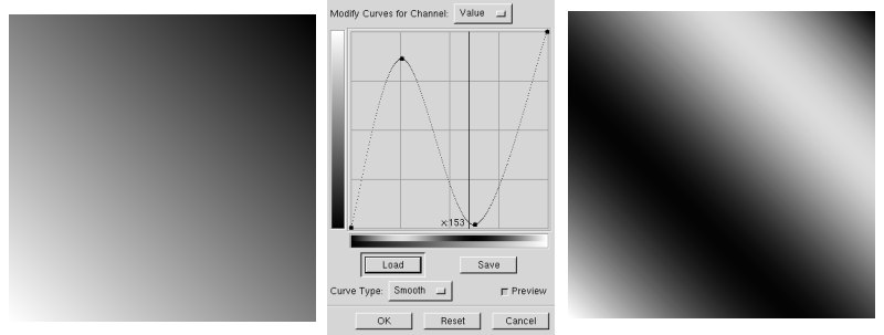
The gradient on the left is transformed by the curve into the image on the right. This kind of treatment isn't useful on photographs, but shows what Curves can do and can work well on computer-generated images.
After doing a lot of work on damaged images, I've come to the conclusion that fixing an image is a magician's art, there's very little science involved. The science is in the numbers, in what the curve does to the image. The magic is making it amount to something that looks good, and that isn't easy. I could have shown you this with a "real" image, but the effects are just as obvious on the plasma image and the only way to learn to use colour corrections is to practice yourself.
As always, subtlety is a good thing: if increasing the contrast makes an image look better, then increase it until you start to think it's too much. Then pull back well beyond what you thought was the acceptable limit. As always, your mileage may vary, but this has almost always worked for me - and saved me from posting some blaringly contrasty images. You look at that neon-bright version of an image too long and it starts to look okay ...